June 15, 2020

DIY Modern Farmhouse Gallery Wall


 Hello!

I wanted to share a little about how I made this gallery wall since everyone asks about it when I share my living room. I did this a few years ago, and I don't have any pictures of the process (except in stories), so this will be a verbal tutorial -- luckily it was a really easy process! I do have those stories saved in a highlight on my instagram page if you need a visual for the instructions. It's called "botanical prints."

Let me start by saying that I got the idea from a post by Jessica at Bravo Homestead on instagram. This one, to be exact:
So really, my gallery wall is just a shameless copy, but I told her I was doing it so it's okay right? 😅

Step 1: Go to Biodiversity's flickr account and sift through alllllll the digital files to find your favorite prints. They have everything! When picking mine, I limited myself to those with similar backgrounds so that I could have a more uniform look. All of my prints have a yellow-tone background.
Step 2: Print your files - I got mine done at staples in an 8x10
Step 3: Get your frames. I just bought simple brown "wood" frames at walmart that are 11x14 matted to 8x10. I don't see my brown online (I bought them in-store), but I do see black and white options.
Step 4: Attach twine to the back of the frame in each top corner. I used a combination of hot glue and e6000. I put a generous blob of hot glue in the top left corner, added the twine and held it in place with a pencil/bamboo skewer (anything to not have your finger touching hot glue) until the glue began to set. Then, I did a blob of e6000 on top of the twine to fully encase it in glue. Repeat on top right corner.
Step 5: Hang the hooks on the wall with! The hooks I got on amazon are currently unavailable, but these look to be the same. This just took some measuring to get it all spaced evenly. I started with lining up the top of one hook with the top of the trim for the built-in to the left (see first picture below), then I hung/held one of the frames to see where the bottom and right side of the frame would hit and lightly marked those spaces on the wall with a pencil. I wanted the frames to stretch across the back of the couch, so I measured that space and subtracted by 44 inches (the width of four frames side by side) to see how much room I had to play with for the space between the frames. I played around with it on the floor until I found a space I liked, Then I hung the rest of the hooks accordingly, using a frame as a test piece as I went. It took a little bit of time and spatial reasoning, but it was worth it!
Step 6: Hang your frames! I didn't want to trust the glue completely because as we sit on the couch we bump into the wall and they're plaster walls. I used anchors when I hung the hooks and I added a command picture strip to the bottom-left and top-right corners of each frame. I wanted to make sure they were really not going anywhere! The picture strips help to distribute the weight so it's not just on the wall by hanging on the twine (which I thought would put too much tension on the glue). They've been hanging here for two years now with no trouble!

I absolutely love how this project turned out! I'm really bad about changing my mind, so I put this project off for years because I knew it would take some time. I also couldn't think of a way to fill more space on the wall without having to add even more prints, so when I saw Jessica's post with the hanging frames, I knew that would be the perfect way to fill more space without adding more prints.
 They add so much character and completely make this space feel like "us." I added a mustard pillow to the couch recently to pull out the mustard/yellow color in the citrus print on the bottom row. I love that these prints go with any season and any color scheme!
 They're even fluff-butt approved!


prints printed at staples -- $0.55 x 8 = $4.40, so let's call it $5.00
twine and glue -- had on hand from other projects (free)
frames -- $8.64 x 8 = $69.12, so let's call it $70.00
hooks -- $11.89, so $12.00
command picture strips -- pack of 12, but I needed 2 because I used 16 sets $13.50 x 2 = $27.00

TOTAL: $114 -- not exactly "cheap" but definitely not as expensive as it could have been!

May 19, 2020

Nursery Tour + DIY Faux Crib Skirt


When we first bought this house, there was this tiny room at the top of the stairs that we never really knew what to do with. Our house was built in 1943 and our best guess is that this room was built with the intent of being a nursery (it's just big enough to place a crib in the middle with about two feet on all sides and no closet) but since we didn't have any kids it kind of became a catch-all room. When we found out we were pregnant, this was the obvious choice for our little one's nursery (it's right outside our bedroom), but since it's so small I made sure to keep everything light and bright to make it feel larger. Now that we have Ellis it has become my favorite room in the house!
The down side to this room being so tiny is that it creates some storage issues (remember I said no closet!). For his clothes, we just have his dresser. That's it. It holds all of his clothes, his bibs, burp cloths, towels, sleep sacks, blankets, etc. So we are very selective about what we actually purchase. If we don't absolutely need it, we don't buy it. It's also helpful that my sister had a baby 3.5 months after I did, so we can get things he outgrows out of the dresser as quickly as possible to make room for his new needs.
We have a long wicker basket to hold diapers, wipes, creams, and ointments. This room isn't big enough for a dresser that can double as a changing table, so we typically change him on a portable changing pad in his crib or on the rug on the floor. We also needed a lamp for night time use - I found this small one so that it wouldn't take up too much visual space.
Side note about this dresser and the crib: my mother-in-law used this furniture when my husband was a baby (1990) and again when his brother was born (1997). It's so special that Ellis gets to use it now too! The black rocking chair is a family piece too. In fact, the first question I asked my dad after we told our families we were having a baby was if I could use this rocking chair. This was the one my grandmother used when my dad was a baby. I love that the major pieces in this room are a part of our family history!
Since the wallpaper has woodpeckers and owls on it, when I saw this owl basket at Target I knew I needed it for Ellis's room! When storage is an issue, cute baskets go a long way - this one houses toys and books and we have another cloth basket next to the dresser that acts as a hamper. Even with our best efforts to keep everything to a minimum, I ended up having to use the space under the crib for storage too. Therefore, I wanted to hide it with a crib skirt, but I couldn't find one at a price I was willing to pay nor could I find one that would actually go to the floor based on our measurements, so I "made" one! This is the best part of DIY projects - you get exactly what you want/need!
The first thing I did was to cut a 1x5 down to the length of the frame the mattress sits on for all four sides (I ended up using 2). Now, instead of sitting on top of the frame, the mattress sits level on top of the wood frame. Then, I simply used a drop cloth and a staple gun to attach the fabric to the wood. I used the pieces of the drop cloth that were already hemmed, but on the cut side that hangs down I used fuse tape to iron a "hem" so that there are no raw edges on the visible skirt.
Lastly, another struggle with the room size was where to safely put the camera. We tried to put it on the wall, but the only way that we could position the camera on the wall and actually have full view of the crib is if it was angled in the corner (which wouldn't work because the camera has to mount on a flat surface), but if we moved it over on the door frame it worked just fine. I was really hesitant to drill a hole in this old door frame, but sometimes you gotta do what you gotta do.
What else do you do to create storage solutions in tiny spaces? I'd love to hear more ideas!

(ignore that cord in the corner - we've since gone up in the attic to finish pulling it through)


Because being frugal is in my roots (raised by two teachers/am a teacher myself), I like to see how far I can stretch my budget. Here's how well I did for this room:
(I'll link to what I bought/something similar where I can - none of these are affiliate links)

peel and stick wall paper - target (online)  $25(4 rolls) + $20(1 roll) = $120  (it's gone up in price since then)
                                                                     also sold at home depot and lowe's (both online) for a little cheaper than target's new price
paint color on bottom half of wall and trim - Wispy White from Valspar  free (leftover)
crib - family furniture  free 
crib mattress - gift from MIL  free
crib sheets - target  $10
crib skirt - DIY  $23   (here's the drop cloth I used with plenty leftover)
gray/blue wall hanging - kirklands  $30   (If I were to do this again I might just attach planks together, paint them blue/gray, and then                                                                                                                                                               frame it out in a chippy white)
E initial sign - Hobby Lobby  $8
owl toy basket - Target  $35
rocking chair - family furniture  free
boho fringe pillow cover - Hobby Lobby  $9
rug - wayfair  $42
curtain rod - Walmart clearance 6 years ago  free (already had on hand but never used)  similar here
gray curtain panel - At Home $15
branch curtain tie-back - Urban Outfitters  $16  (worth noting, I LOVE this one but couldn't bring myself to spend the money on it)
ceiling light - Wayfair  $72
owl hook on door - gift from mom  free
dresser - family furniture  free
round gold mirror -  TJ Maxx  $30  similar here (but more expensive)
eucalyptus around mirror - Hobby Lobby  $5.50(2 sprays) = $11
table lamp - Target  $35
wicker basket for diapers/creams - Target  $12
cloth basket (hamper) - TJ Maxx  $12  similar here (but more expensive)
gray trash can - TJ Maxx  $10  similar here (but more expensive)

GRAND TOTAL: $490
Entire room from start to finish, top to bottom, for around $500?? I'll take it!
(And if I hadn't splurged on doing the wallpaper and just painted the top half it would be at least $100 less!)


March 16, 2019

Accent Table Dilemma

For the last two years we've gotten some sort of large piece of furniture for the living room right at the beginning of March (both years it happens to have been from Wayfair), which also happens to be the time we all get that renewed energy to start/finish all these wonderful spring projects. The sun is out! It's warm outside! The flowers are blooming! Mother Nature is beautifying her space, so we all feel like beautifying ours too.

Last year, we got our couch and accent rug, but this year we decided we needed more seating so we got this accent chair in cream, so that it wouldn't clash with the taupe-gray couch. I like both items together, but that end table is MASSIVE, and so is that chair (for the space), so I'm now on the hunt for a new end table. Preferably "farmhouse" style because I don't want the room to look too modern, as that will make my grandparents' blueberry sign above the mantle seem out of place, and I'm absolutely not willing to move it.
(Also, I plan on layering some jute rugs underneath so that the rug isn't too small anymore AND it kind of bothers me a bit that the legs on the couch and the chair are different woods, but I'm hoping once I get a coffee table in place I won't be able to see it so it won't bother me as much.)

BUT I'm having trouble finding anything that will work for me! I wanted to just buy some this time around since I don't really have time to DIY and I'm ready to have this room closer to looking "finished," but everything is too big or too tall or too industrial or too modern and I've completely run out of local places I can look. I'm sure these pieces would be great for other people though! The problem is that our couch is a short little guy, so the average end table height looks funny. Here's a rundown of what I've looked at in case any of you with normal-height couches are in the market for some farmhouse style end tables!

1. Spindle Wood Accent Table -- I really wanted this one to work, but it's just way too tall. I like the warm wood with a subtle whitewashing and the more intricate base, but it's not meant to be because that's not a DIY skill I have.
2. Spindle Center Round Accent Table -- same story as #1, but even taller.
3. Whitewash Round Three-tiered Wood Accent Table -- I think this one is the tallest of them all! I love it, but it wasn't ever an option for me because of that fact.
4. Embossed Round Accent Table -- I was SO SURE about this one that I bought two, brought them home, put them in place, and nope. Too tall. So, I unscrewed the bottom part of the legs (beneath the shelf), removed the shelf, and put it in place by the chair. Right height, but something just didn't seem right still. I'm thinking the overall table space was a little too small for the scale of the space it was needing to fill? I don't know.
5. Natural Wood Accent Table -- LOVE this one -- didn't actually see it in the store.
6. Light Brown Wood Accent Table -- Love the gray-ish color of the wood and the whitewashing on this one, but again, too tall.

I looked at some local places that don't have online shops and struck out there too. We need a table that is at MAX 24" tall, and these are all well above that!

I absolutely cannot afford Kirkland's for furniture, but it's pretty to look at and gain ideas from.

1. Omari Cream Twisted Legs -- I'm thinking a round or square shape will fill the space between the couch and the chair best, as I have the chair at an angle so the room feels a bit more open. I think a rectangle shape would have to be turned so that it sits vertically, not the typical horizontal orientation.
2. Tori Wood Accent Table with Metal Top -- I'm drawn to this one since it kinda looks like it has a concrete top (which is something that could be done as a DIY for real!).
3. Arch Sides Cathedral Side Table -- Holy heart eyes! If I had an endless supply of spending money and a normal end table situation going on, I would have already purchased two of these! I might have to set my DIY sights on something inspired by this table.
4. Katina Galvanized Front Wooden Chest -- This one would be an easy DIY, though the metal would not be the same and I like the slightly floral nod going on in the metal.

Next on the DIY inspiration list (because I was just raised too frugally to drop $100+ on one end table) is amazon. There are a couple of decor brands I like on amazon home, like Stone & Beam where we got our duvet cover, but it is not very often that I find myself actually making a purchase. I just really like to window shop and gain ideas, then sit on them for five years* before I actually make my move.

*I'm kind of being sarcastic, but also kind of not.

1. Metal Inlay Trim -- My biggest takeaway from this piece, apart from the chippy white paint, is the metal piece along the bottom edge of the table top. It's hard to see in this picture, but if you go to the site and hover to zoom you'll see that it's not wood. I like this idea to add an unexpected texture/element!
2. Shiplap Table -- I'm calling this the "shiplap table" because that's what I see first -- the white wood planked top and sides in a sort of brick-lay pattern, not the typical straight, even pieces. I like it!
3. Scallop: Round -- These last two are the same, but in a round vs. a rectangle shape. This one gives me the idea to make a scalloped border (like our entire house has around the outside), but I would do a chippy white distressed look as opposed to the over-distressed (in my opinion) finish going on here.
4. Scallop: Rectangle

I think my lesson learned here is that there are two reasons why I DIY:
1. I'm cheap and enjoy the creative challenege of making things for less.
2. I'm picky and DIYing let's me get exactly what I want.

So I'll probably just end up making something inspired by quite a few of these guys, but that means I won't have a solution as quickly as I'd like. And so goes life.


March 9, 2019

Joke's on Me..

HA! When will I learn? I teach high school, and I always seem to teach something new each year, so my actual days during the school year are always insane and exhausting. All I do when I come home is watch TV/Netflix (lately, it's been some combo of HGTV, Jeopardy, and all the things in the Marvel Universe). On my weekends, I do all the things on my to-do list + school stuff (lesson plans, materials, grade essays, cry). CLEARLY, I don't remind myself to also post stuff about what I'm doing with those projects. Do better, Alia!

Anyway, let's look back at that "Summer" to-do list (biggest joke ever to limit myself to one season).

This "almost spring" season always feels like a refresh for me, so I've had lots of plans running around in my mind. Maybe I'll carve out some time on either Saturday or Sunday to try and corral all of those ideas into this space on the internet, because I'll liable to forget some of the things I had in mind! Plus, spring break is in two weeks, so I'll definitely be crossing some more things off of that list by then.

June 28, 2018

Color Crush: Dark Ink

I have always had a strong pull to different colors at different times. I've never really been able to answer the questions "What's your favorite color?" because the answer has always bee different. And if it's always different, then can I really call it my favorite? For most of my life I could at least say my favorites were cool colors, but then something happened and I became a coral/dusty rose/millennial pink girl. I was never a pink girl. Thanks, social media..? I don't really know what it was.

Whenever I go new places, I'm first drawn to a place because of the color palette. Driving down the road/walking through downtown I'll say "I love that door color!" and snap a picture. When we were in Charleston, SC a few week ago for my sister's wedding I kept specifically taking pictures of window boxes/house fronts where I was drawn in by the color palette. When I'm shopping (for clothes, the house, my classroom, etc.) everything I end up taking back to the dressing room and/or actually leaving the store with falls in the same color scheme. When I'm painting, I have a knack for being able to identify the undertones of a color that I want to use and being able to mix it up. The same way every time. When I was roughly three years old, my mom would ask me if certain clothes matched together. Color's my thing.

So I thought it would be fitting to round up different pictures from around the instagram/blog world that show off the color I'm currently crushing on. Right now, it's a dark blue-almost black-with a dash of charcoal gray kind of color.

I think I first started being drawn to this color as I was looking at what color would look best with the brick of our house. I wanted to make new shutters (they've been made, but not quite finished and ready to post yet) and we need to replace the front door, so I started looking at the brick and noticed it had this almost black color in certain places. However, we had originally painted the door/shutters with a bright navy/cobalt blue and I loved the blue, so I didn't want to go straight black with the new color. Plus, black is just a little too traditional for the look of our house.
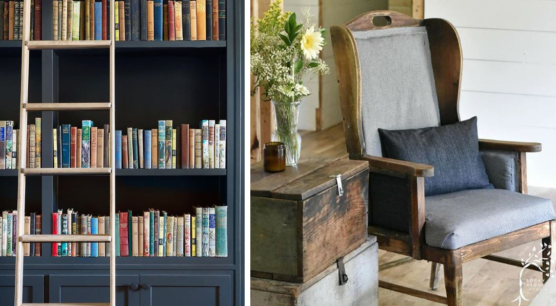
 left: @joannagaines | right: @rockyhedgehome
left: @e.t.shown_home (found via @jodie.thedesigntwins) | right: @peachandpinehome

I love that this color truly works for interiors, exteriors, accent pieces, and beyond. It even works regardless of your decor style (modern, farmhouse, boho, etc.). And since it does have a cool/blue undertone, it pairs well with other cool colors, like the greenery and gray chair above, and the eucalyptus and gray-washed tray below. But even though it's a cool blue-black, it doesn't have to stay with cool colors. It looks equally great with the warm wood tones from @rockyhedge home and the gold from @peachandpinehome as it does with the gray wood from @lemondropsreclaimed.
 left: @lemondropsreclaimed (found via @mmsmilkpaint) | right: @markethouserestorations (found via @oldbarnpaint)
 left: @peachandpinehome (photo by @carolinesharpnack) | right: @finn_and_bo (found via @oldbarnmilkpaint)
left: @farmhouseonboone | right: @timber.cottage

Just for fun! Here it is in small doses, just in case you think the dark color is just too bold for a whole wall or large piece of furniture. Or if you need to tip-toe into a color before truly committing.
left: @missmustardseed | right: @thecottonfieldcottage

All images found via instagram and tagged beneath to reflect ownership. I only own the very last photo (blueberries).

June 22, 2018

Entryway Mood Board

The first project I want to tackle this summer is the entryway. There are just two projects I want to complete for this room this summer -- building a bench and replacing the front door. I would love to replace the light fixture too, but I don't know about that one yet because I think it will mean replacing three at once, just the hallway lines up with the entryway and I would want them all to match.

Before I can wrap my head around what all I want (especially for those finishing touches), I think I need to create a mood board. I've never officially done one of these on paper (physical or digital). It's always just been all up in my head. However, when I was little I would draw out rooms on graph paper ALL. THE. TIME. It's almost like I always wanted to be an interior decorator and then changed my mind right before I went to college or something...

My decor tastes are all over the place at the moment:

  • I like the modern look, but only to a small degree. I think I just like the clean lines.
  • I like the farmhouse look, but only when it's authentic. If I'm going to have an old piece in my house it's going to come with a story, and preferably a family one at that.
  • I like the rustic look because it doesn't have to be perfect and it only gets better with nicks and dings.
  • I like the boho look, but it just doesn't really feel like "me" all the time.
So here's what I think I want for the entryway:

Photo/Item Sources (none affiliated, just what I found): metal tobacco basket, mirror, rug, leather pillow, bench, short vase, tall vase, wall hanging
  1. Modern elements: leather pillow, octagon mirror, moody dark blue
  2. Farmhouse elements: tobacco basket, simple wooden constructions, white walls, black/white print rug, jug vases? (I'm guessing that's where these fall)
  3. Rustic elements: simple wooden constructions (again), dark wood plank floors, dark wood stain on bench/table top, the tobacco basket is metal instead of balsa wood
  4. Boho elements: woven wall hanging, block print rug, plants!

Since I have a real life budget, those won't be the *exact* pieces we end up with, but what I already have and what I plan to build are incredibly similar! This has me excited to go build that bench now! 


June 20, 2018

Summer To Do List

I'm a list-maker. My motivation THRIVES from checking things off of my list. In fact, sometimes I'll add things I've already done (but didn't think about while making my list) just to get the feel-good vibes of immediately striking though it. Needless to say, in our foreclosure fixer-upper, there are several things that NEED to get done, and several others that I just *want* to get done. And the wants are almost always more fun than the needs. The wants are what run though my brain every time I look at a new corner of the house. Here's an example of what's currently running through my head:


But, y'all, summer break is only TWO MONTHS long, and we're already down to one and a half!

And when I look at a list like that, I just get overwhelmed and end up on the couch, snuggling with Hamilton, watching Netflix and eating ice cream instead. And this is why none of it has happened yet this summer (that and our two out-of-town weddings this month...).


So what I have to do instead is look at what can be completed the easiest/quickest/cheapest...

OR

...what will make me feel like the room it will be housed in seems "done," or at least closer to being done (because we all know no room is ever done*).

In this case, I'm going with the latter option. We have our second of those two out-of-town weddings this weekend, so when we get back I plan on making a bench to match the entryway table.

I built an extremely modified version of Ana White's "Rustic X Console" plans for our entryway table. My favorite thing about DIY pieces is the customization. Our house has very odd dimensions in a lot of places. We needed a landing space for mail and keys and such, but the dimensions were way too short and way too narrow for any entryway/console table we could find in a store. 


And in the spirit of full transparency... I messed up on the squaring of that left leg there. It's so off. It bothers me so much. I want to fix it, but have too many other things to do to worry about it (see list above...), so I just found an angle to snap a picture that hides it as best as I can and move on with my life... for now.

My plan is to build Ana White's "Providence Bench" for the other side of the front door, but again modify it to fit our space. I'll also likely swap out the 2x6 bench top for a 1x6 like I did on the above table. Our entryway space is just so small that the 2x6 seems like it would be too bulky. I plan on finishing it in the same color/style as I did the table, but plans always seems to change/get modified around here!

*Speaking of a room never being done, as I was typing I remembered another thing that is actually pretty high on my wish list to get done this summer: REPLACE THE FRONT DOOR.