
Whenever I go new places, I'm first drawn to a place because of the color palette. Driving down the road/walking through downtown I'll say "I love that door color!" and snap a picture. When we were in Charleston, SC a few week ago for my sister's wedding I kept specifically taking pictures of window boxes/house fronts where I was drawn in by the color palette. When I'm shopping (for clothes, the house, my classroom, etc.) everything I end up taking back to the dressing room and/or actually leaving the store with falls in the same color scheme. When I'm painting, I have a knack for being able to identify the undertones of a color that I want to use and being able to mix it up. The same way every time. When I was roughly three years old, my mom would ask me if certain clothes matched together. Color's my thing.
So I thought it would be fitting to round up different pictures from around the instagram/blog world that show off the color I'm currently crushing on. Right now, it's a dark blue-almost black-with a dash of charcoal gray kind of color.

I think I first started being drawn to this color as I was looking at what color would look best with the brick of our house. I wanted to make new shutters (they've been made, but not quite finished and ready to post yet) and we need to replace the front door, so I started looking at the brick and noticed it had this almost black color in certain places. However, we had originally painted the door/shutters with a bright navy/cobalt blue and I loved the blue, so I didn't want to go straight black with the new color. Plus, black is just a little too traditional for the look of our house.
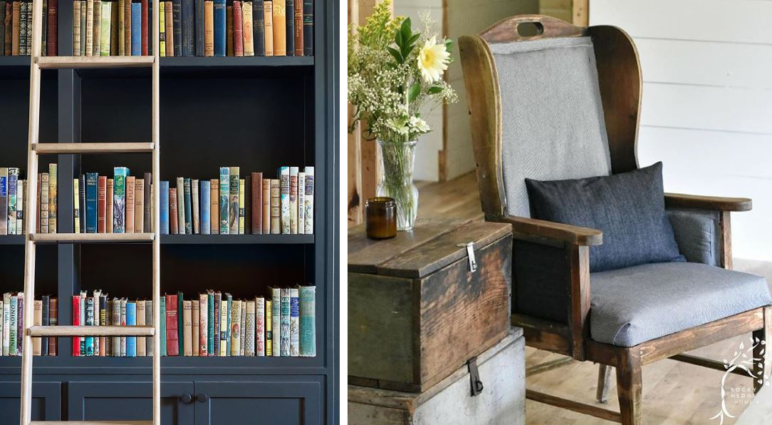
left: @joannagaines | right: @rockyhedgehome

left: @e.t.shown_home (found via @jodie.thedesigntwins) | right: @peachandpinehome
I love that this color truly works for interiors, exteriors, accent pieces, and beyond. It even works regardless of your decor style (modern, farmhouse, boho, etc.). And since it does have a cool/blue undertone, it pairs well with other cool colors, like the greenery and gray chair above, and the eucalyptus and gray-washed tray below. But even though it's a cool blue-black, it doesn't have to stay with cool colors. It looks equally great with the warm wood tones from @rockyhedge home and the gold from @peachandpinehome as it does with the gray wood from @lemondropsreclaimed.

left: @lemondropsreclaimed (found via @mmsmilkpaint) | right: @markethouserestorations (found via @oldbarnpaint)

left: @peachandpinehome (photo by @carolinesharpnack) | right: @finn_and_bo (found via @oldbarnmilkpaint)

left: @farmhouseonboone | right: @timber.cottage
Just for fun! Here it is in small doses, just in case you think the dark color is just too bold for a whole wall or large piece of furniture. Or if you need to tip-toe into a color before truly committing.

left: @missmustardseed | right: @thecottonfieldcottage
All images found via instagram and tagged beneath to reflect ownership. I only own the very last photo (blueberries).
No comments:
Post a Comment